Achieve
DESCRIPTION
A multiplatform To Do App
CHALLENGE
To Do lists are great tools but often enough people spend their days doing meaningless tasks just to have something to tick of the list
SOLUTION
A concept for a To Do app that lets the user categorize tasks by importance and rewards him accordingly - motivating him to work on the most meaningful tasks
MY ROLE
Solo Project
TOOLS
Sketch, Invision, After Effects, Xcode
Approach
ideation & Market research
Mindmap
After the ideation phase I interviewed potential users to see what they are looking for in a To Do app. I also did market research and a competitive analysis to see what users were missing in their current solutions and where the niche for my app could be.
This feature set is pretty basic but it offers the most important tasks users looked for, while allowing the app to stay minimal.
REQUIREMENTS BASED ON THE MARKET RESEARCH
Simplicity and clarity
Modern design
Ease of use and intuitivity
Stability and reliability
Trust and security
Updates and bugfixes
FUNCTIONS
Primary Function
create tasks
check of tasks
3 lists:
today, week and month
Secondary Function
assign categories
assign priorities
assign intervals
create subtasks
delete, copy, move, edit
Tertiary Functions
Progress Bar
Statistics
Synchronization
DISCOVERY
USERS ARE WILLING TO TRY SOMETHING NEW IF IT OFFERS INNOVATION
Looking at the download numbers and reviews in the App Store a lot of people try different To Do apps. Many offers exist but there is still interest in innovative products that offer something special.
VISION
GET THE USER TO WORK ON THE MEANINGFUL TASKS
Keep the users accountable and motivate them to work on important tasks, which will give them the biggest results in the future. This is done by assigning different weights to the tasks. Checking of insignificant tasks will result in little progress.
Design
Clean, intuitive And multiplatform
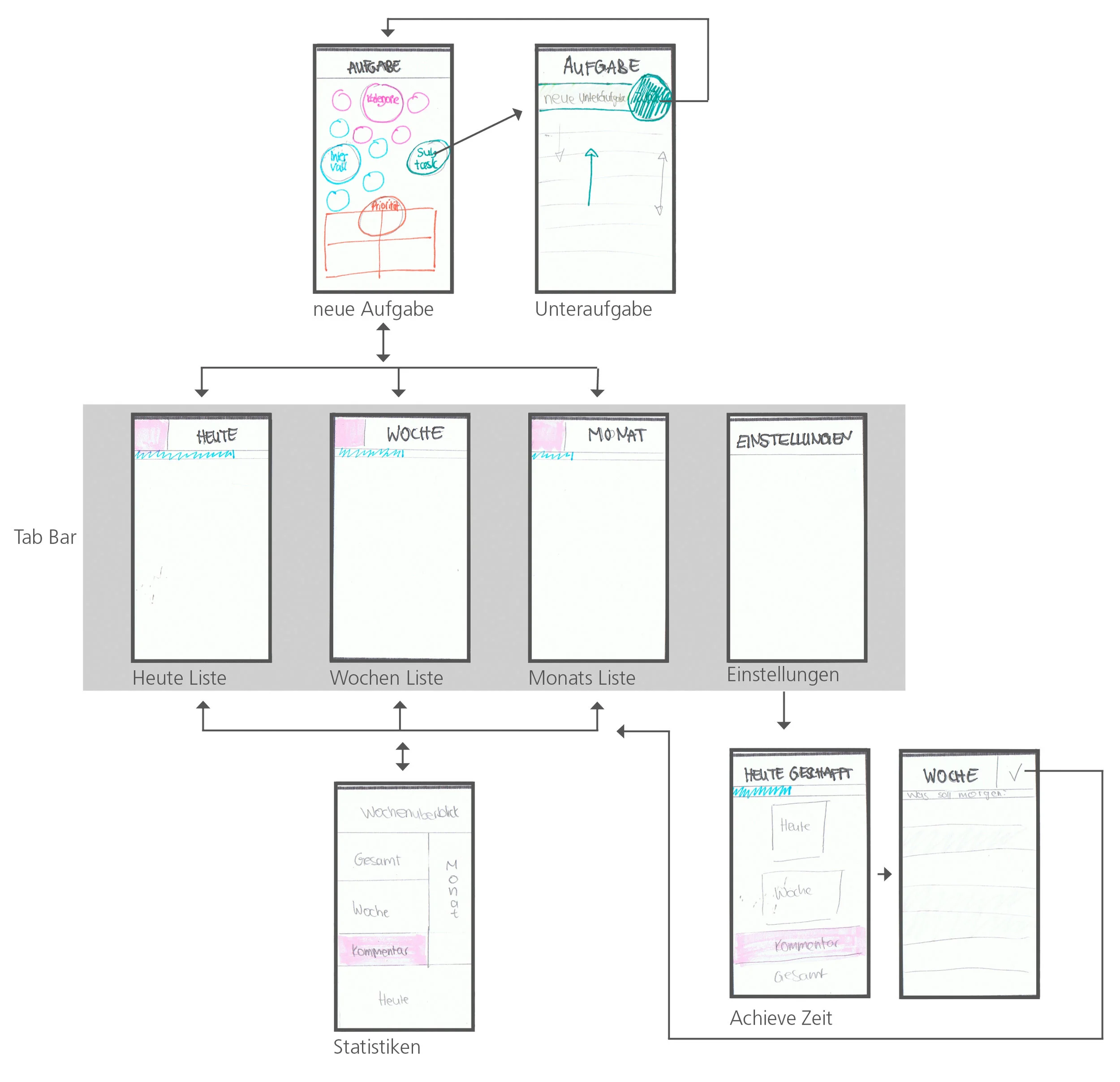
For the Design I started sketching mobile first, since the users mentioned in the interviews that the phone would be their preferred device. A lot of paper prototypes were made to test the interaction concepts with users. Those insights allowed me to iterate quickly.
For example for the navigation, I first considered swiping for changing the list but the users were quick to tell me that they didn’t like it since it won't allow for direct access. So I opted for a tab bar for all 3 lists and the settings.
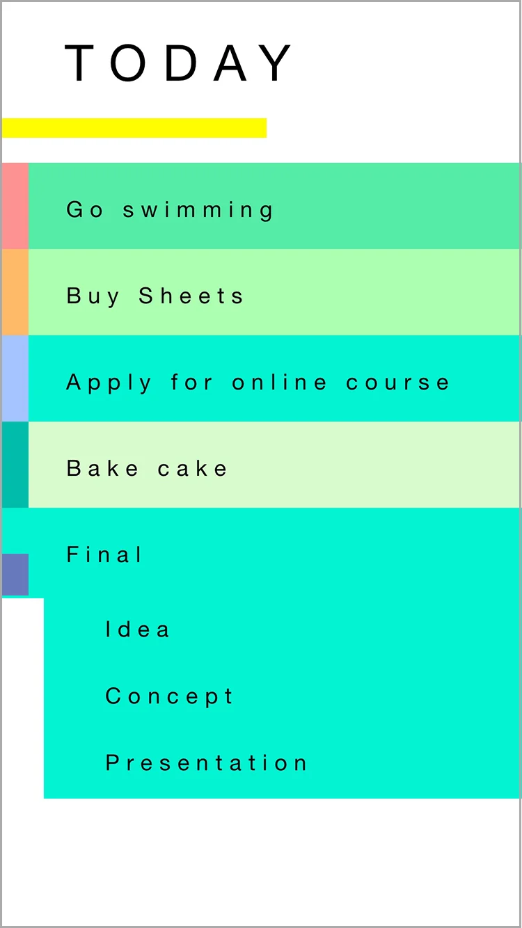
Each task had to show the priority, the category and if subtasks were involved. Those are some early iterations but neither me, nor the users, were very happy with them.
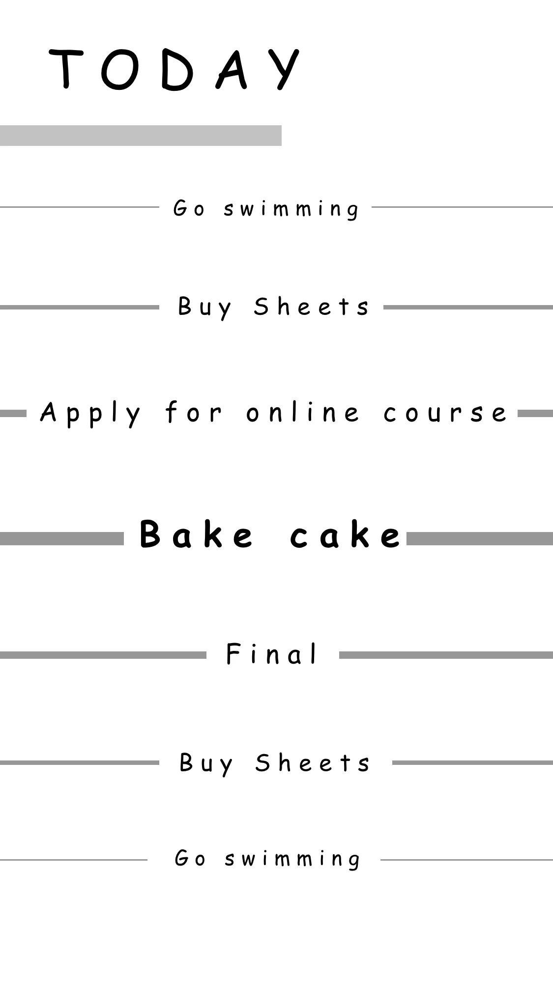
Priority is represented via perceived closeness of the task
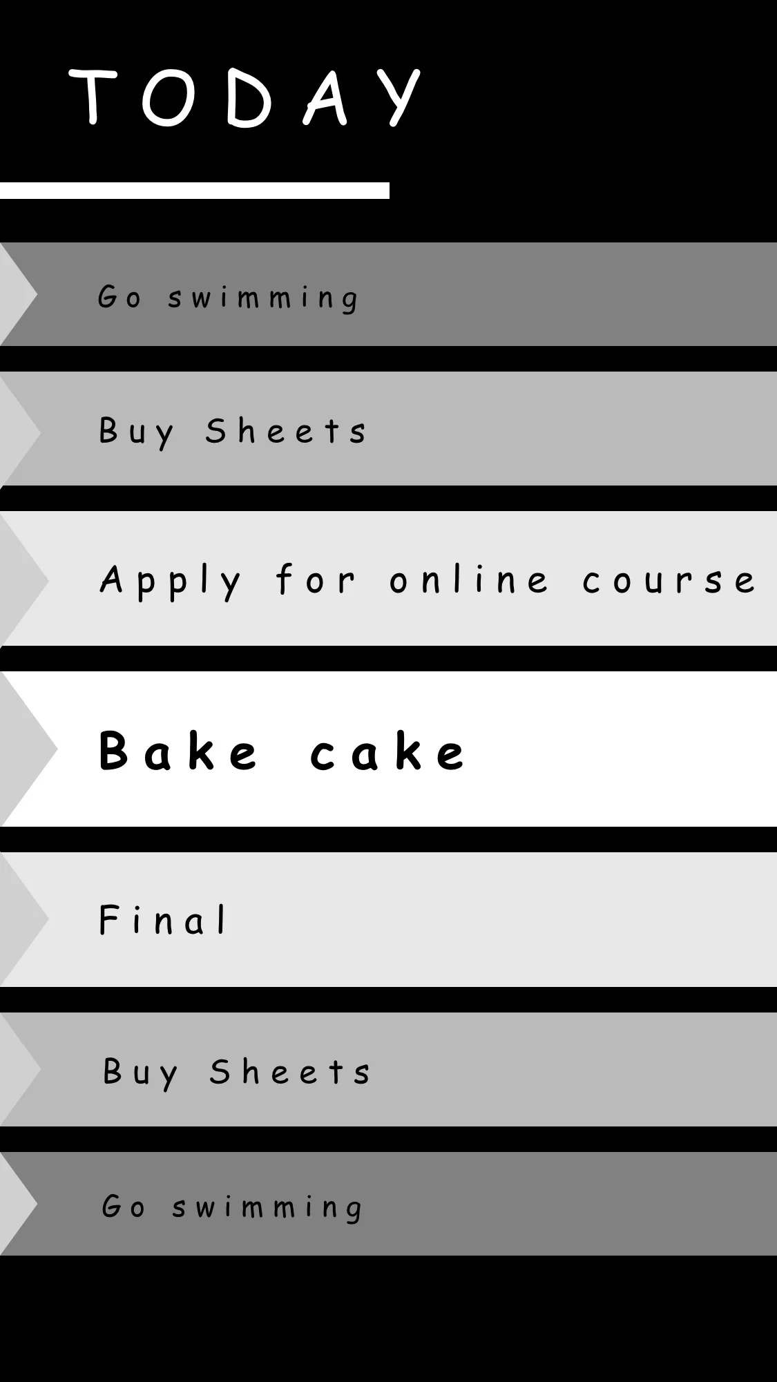
Representing the priority through typography
Priority is represented by the task color and the band represents the category
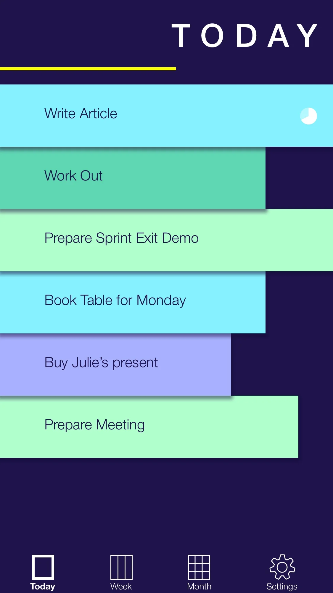
In the final design the priority is represented via the task's length. This draws focus on the most important tasks and also stands for the progress gained by doing the task. The users really liked that metaphor and found it a lot more intuitive than a representation through colors.
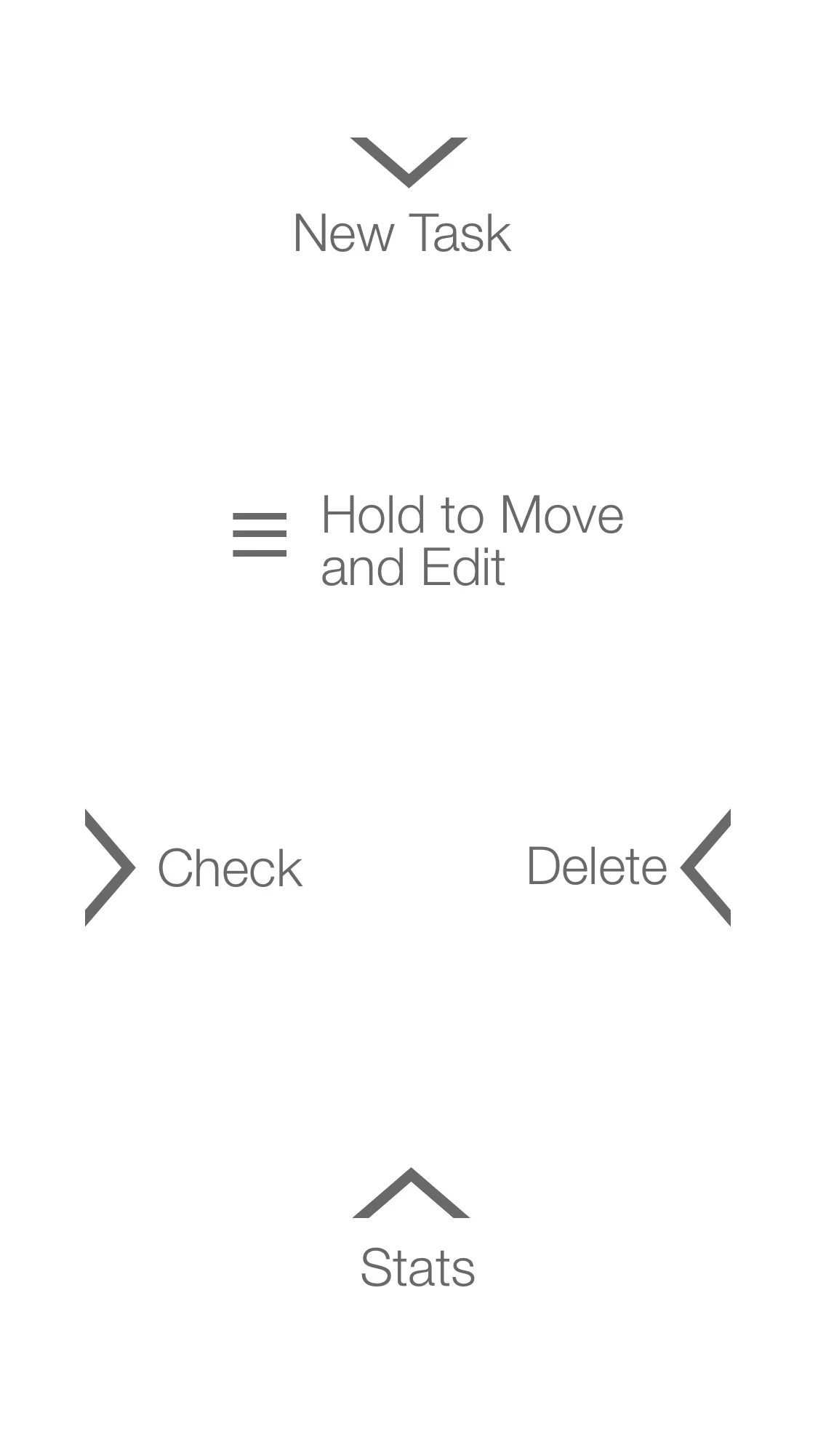
The users found the gestures used in the app quite intuitive, since most of them are familiar in that context.
Moving a task
At the end of the day: Selecting multiple tasks to move
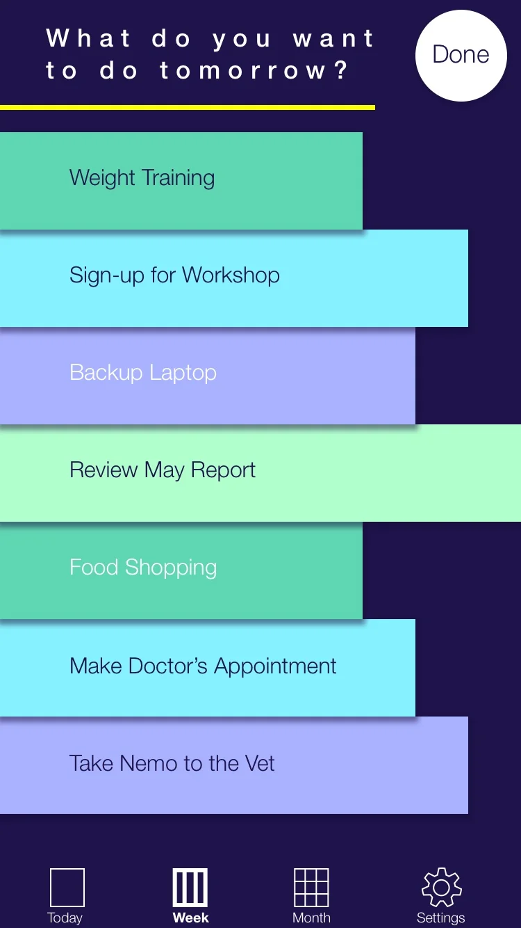
At the end of the day, the app shows the user statistics of the day and asks him to move tasks from the weekly list to the daily list. He can select multiple tasks at once, making the process quick and easy.
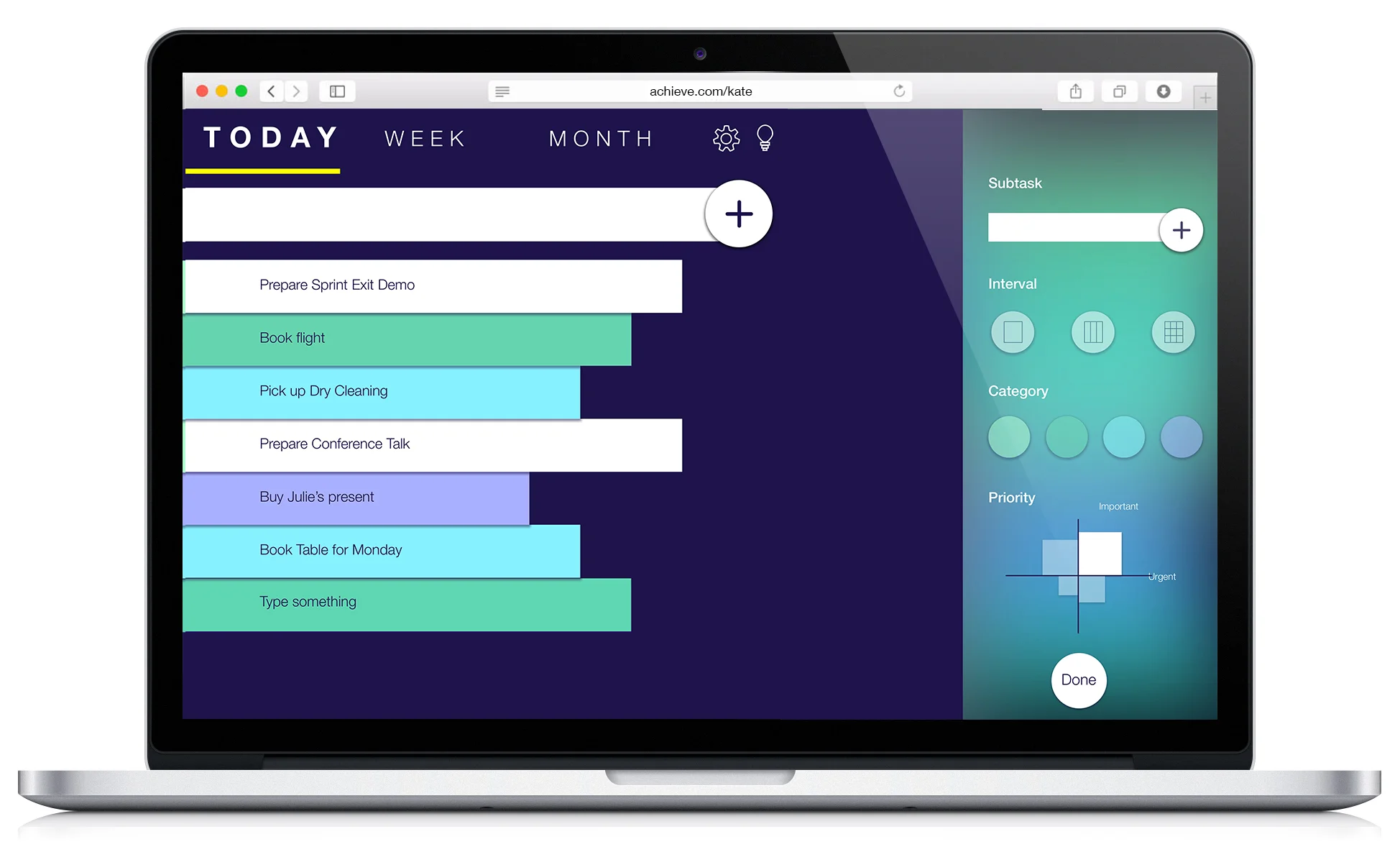
For adding a lot of tasks, like creating a monthly list, users preferred using a keyboard.
The desktop version also allows selecting multiple tasks at once to assign the same category, priority and interval, speeding up the process even more.
The watch supports quick glances at the tasks and the progress. New tasks can be created via voice control but the assignment of category, priority and interval has to be done elsewhere. Users said they wouldn't want to do that with the watch anyway. However, they liked the idea to record a task to not forget it.


