IBM Böblingen Website
DESCRIPTION
A complete Redesign of the IBM Böblingen Website following the IBM Design Language and the IBM Northstar Web Standards. This happened in close collaboration with the Communications Team, Management and Development
CHALLENGE
IBM has undergone a massive change in the last years. From a features first mind-set to a user’s-first, design centered strategy. However, this transformation was not reflected in the website of IBM Böblingen
MY ROLE
Concept, UX Design, Visual Design, Specifications for Development,
Content design was done in a team of 2
TOOLS
Balsamiq, Illustrator, InDesign
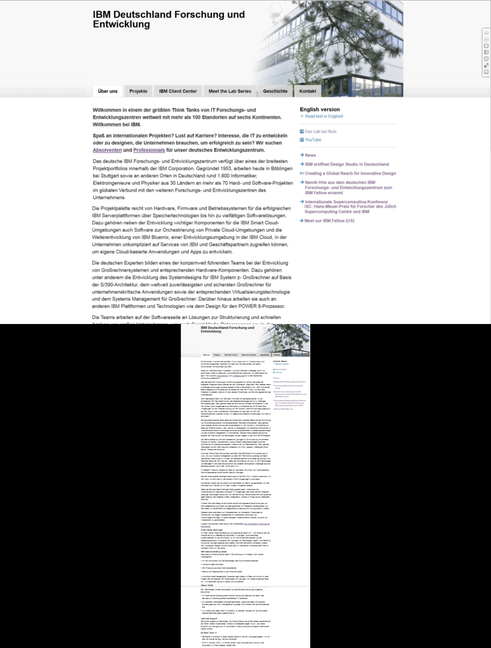
Impressions from the old website
APPROACH
What information does the user really need?
The old website consisted of a lot of unstructured text, which makes it very hard to find specific information.
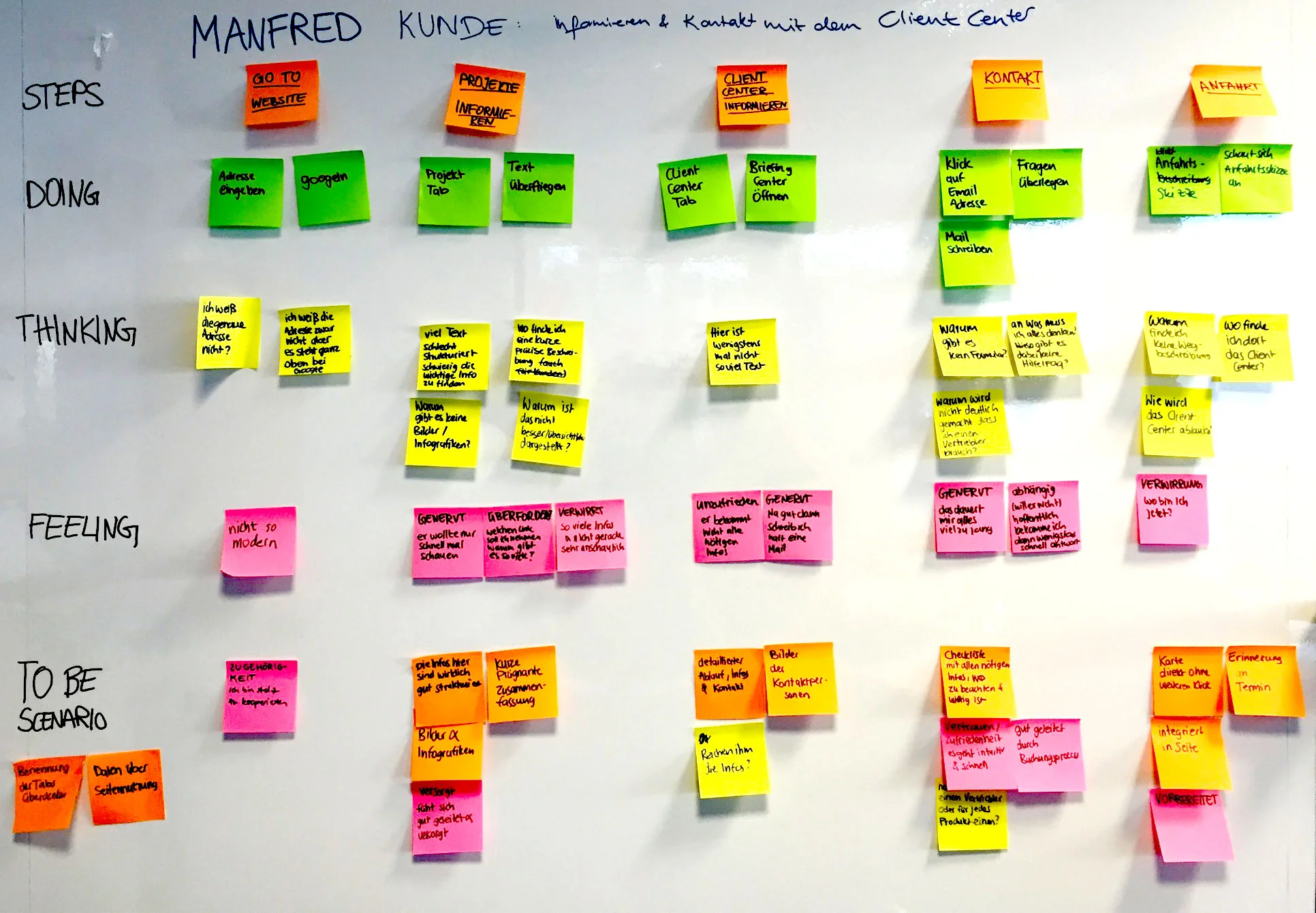
Based upon the information of a briefing with the Communications Team another intern and me did Design Thinking Exercises to understand, who the users of the site were and what their goals and points of interests are. Scenarios were done based on the 2 main use cases.
Empathy Map
As-Is Scenario
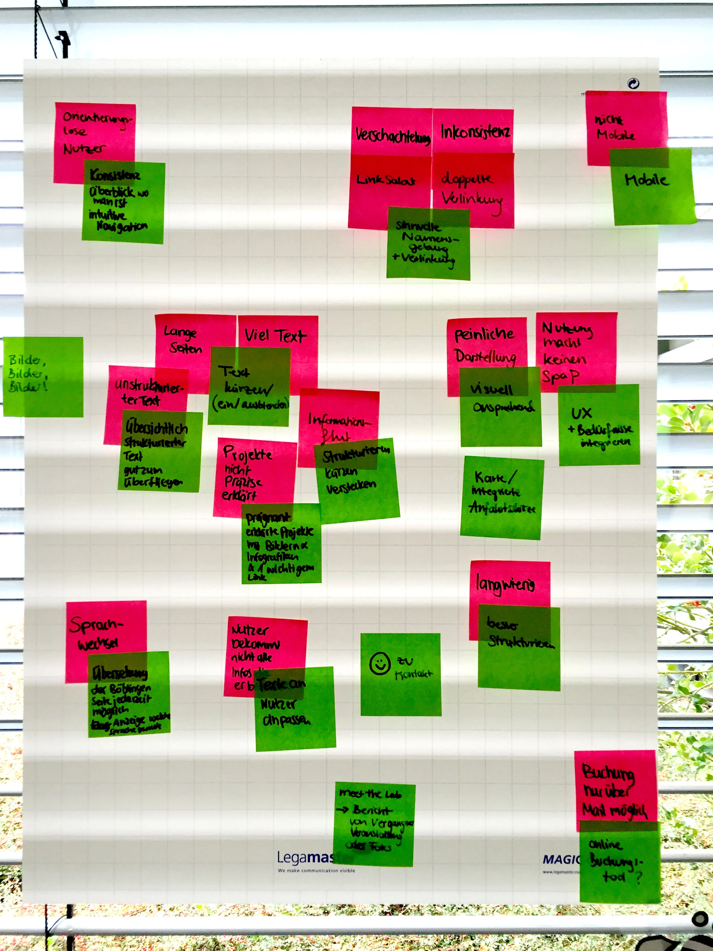
Pain Points
DISCOVERY
It's all about Böblingen
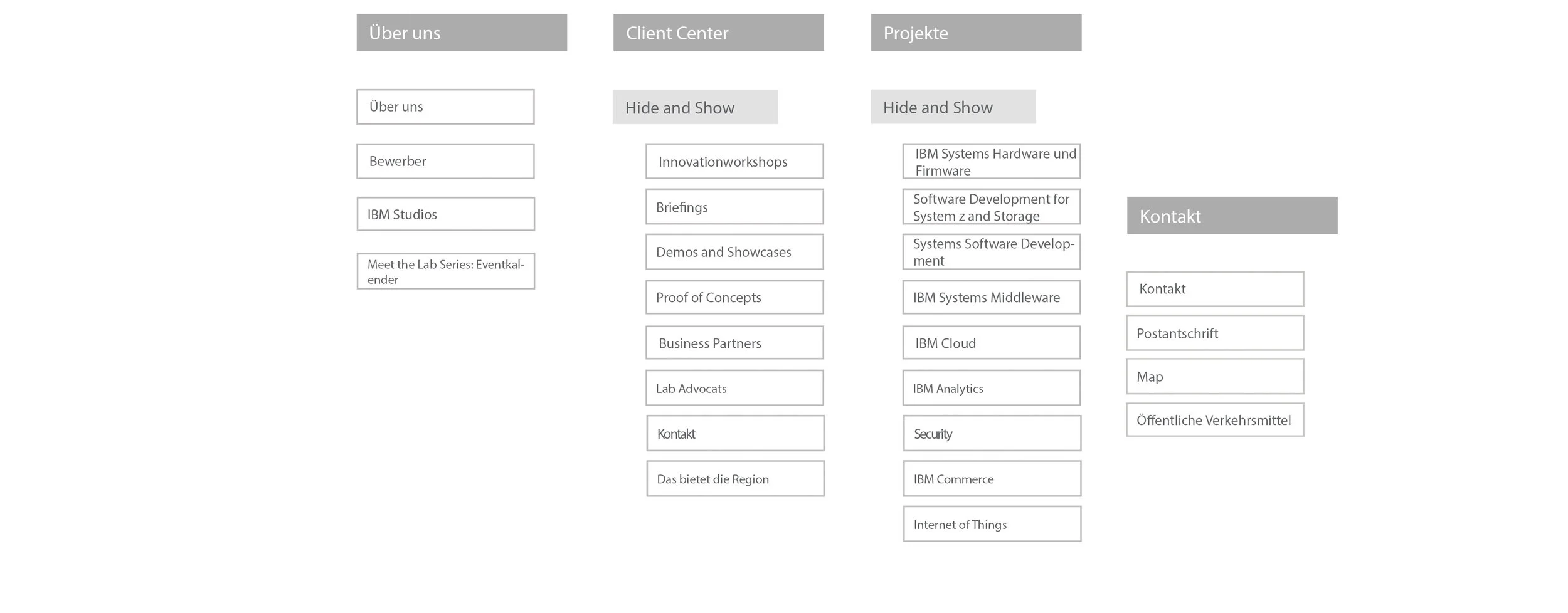
The research findings were validated with the communications team. From there we adapted the Information Architecture to fit the needs of the users and edited the content accordingly. A lot got cut but we also added parts to support the users in reaching their goals.
From then on each of us worked separately on the design to present different options to the management.
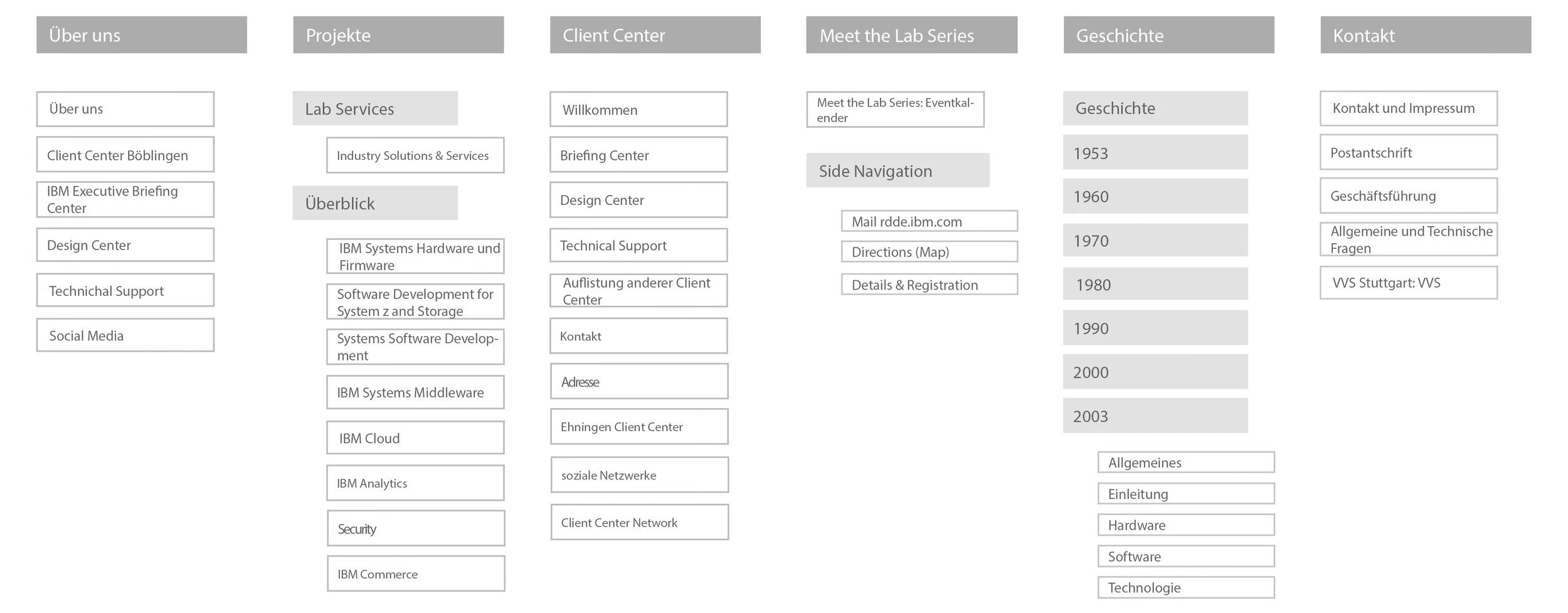
Former Information Architecture
New Information Architecture
THE VISION
WE ARE IBM
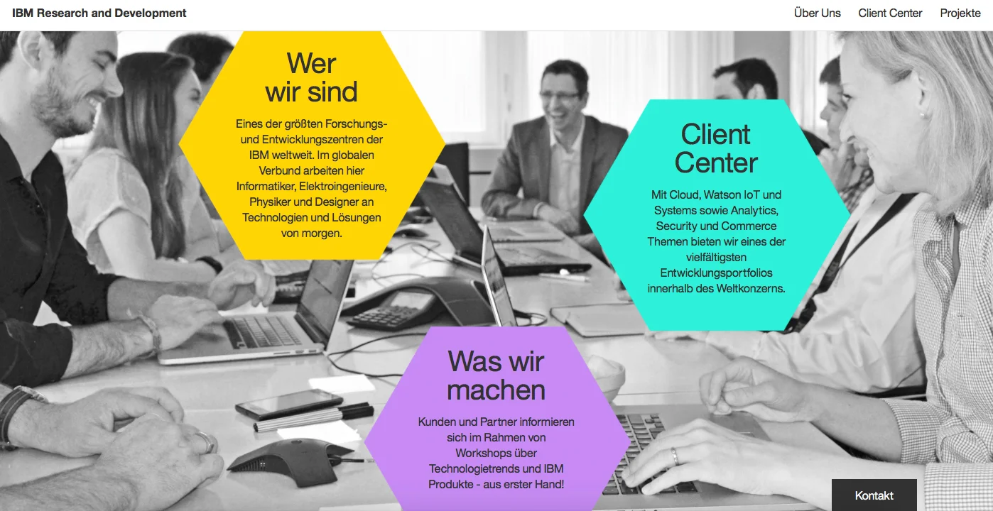
Products are the focus of many other IBM sites but here was an opportunity for the IBMers to be the center of attention. Their hard work makes it all possible, so I put them in the spotlight to give a face to the Böblingen Lab.
DESIGN
Representing the transformation
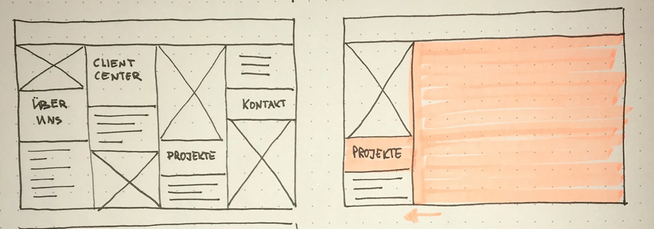
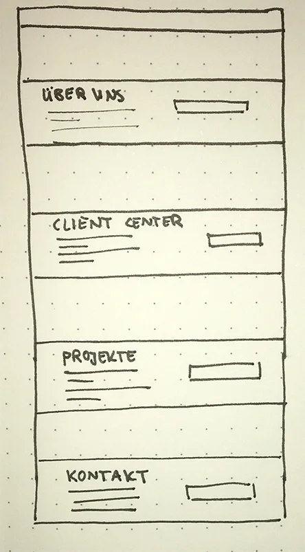
Starting with sketches and then wireframes I ideated on different ideas how to best present the new IBM. The final content was already used to make sure that the design matches its needs and the users can quickly find the desired information.
Sketches for the Landing Page
After the Wireframes were approved I continued with the Visual Design. We pitched our design to management and mine got taken, so I created specifications for the development.
Structured Text with bold keywords allowing the user to scan through quickly
Contact Information with pictures allowing for fast connection and a more personal experience
The Show and Hide provides an overview and allows the users to quickly find their desired information

