renivíe
DESCRIPTION
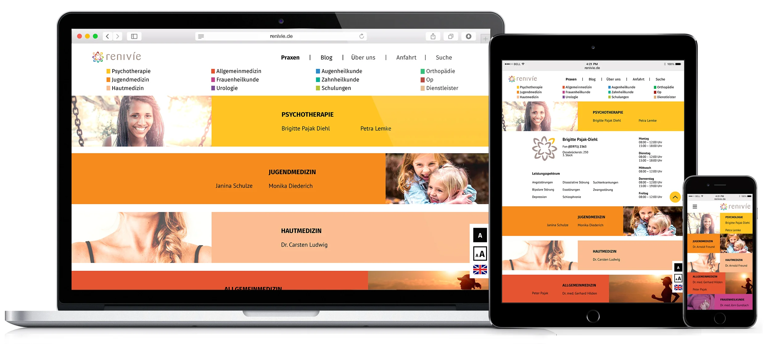
Development of a Corporate Design for a healthcare center uniting doctors from 12 different specialties
CHALLENGE
Creating an accessible web experience to ensure all patients can use it
SOLUTION
Prototype of the website
Design Manual
Corporate Design and examples of use
Team of 3 - MY ROLE
User Research
Logo Design
UX and Visual Design for the Web Experience
TOOLS
Illustrator, Photoshop, InDesign, Axure
Approach
When you think of your doctor...?
To get a feeling for the brand we were creating, we brainstormed, looked at our experiences with healthcare and I went on to ask some other people from different age groups in order to define the core values of the brand.
Family Persona
DISCOVERY
ACCESSIBILITY
The target audience of the renivíe is very broad due to its diversity of medical treatment options. Babies are welcome as well as elders and also people with all kinds of disabilities.
Vision
Therapy, Advice, Simplicity
renivíe stands for competent, friendly and empathetic treatment under all circumstances of life. Uniting doctors from 12 specialties allows for a holistic therapy.
Our second core area is the advice. No patient at renivíe should ever feel left alone, therefore we emphasize on extensive and comprehensive medical consultation through our professional employees.
The third focus point is simplicity. The patient shall always find straightforward answers to all of his questions quickly, be it in brochures, the internet or in a personal conversation.
DESIGN
SIMPLE, ACCESSIBLE AND FRIENDLY
Normally I would do wireframes in greyscale but since 12 different colors are needed for this website I used the colors to see the outcome. It was important that the website looks friendly but also clean and professional.
COntext Analysis
During interviews I looked at the context people would be using the website in, to create a website that gives them the right information at the right time.
GOAL
What is the contact information?
What are the opening hours?
How do I get there?
What are the offered therapy methods?
ENVIRONMENT
private
public
DEVICES
stationary:
pc, laptop, tablet
mobile:
phone, tablet
USAGE
brief and concentrated
MOTIVATION & FEELINGS
acute problem: stressed, anxious, in pain
preventive checkup: annoyed
helping others: worry
While doing user testing with the final prototype I looked at how fast people reached their desired goal and if they ran into problems. Since my research showed a lot of people were anxious I added the images, according to each specialty and color, to create a warmer, more humane look and feel. All of my users reported they really liked it and felt more at ease.
Another focus lay on Accessibility to make sure every user from the target audience would be able to use the website.
Font
Google fonts were used to ensure a common appearance on all devices. Native OS fonts were set as fallback. On top of that the users can enlarge the font.
Color
The color contrast was checked to ensure everything was AAA compatible. 2 colors had to be switched lightly. The colors were only used as an aesthetic mean, not to convey information that otherwise would be lost for people with color blindness.
Contrast
For people with an even greater visual impairment there is the option to switch to white on black contrast.
LANGUAGE
It's possible to switch the language to English. Also it is made sure that easy language is used wherever possible. For example "Hautmedizin" instead of "Dermatologie". Only the therapy names are put in their specific names, since people, who would look at those, know what to look for.
FOCUS
The whole website is usable with only using the keyboard and no mouse.
SCREEN READER AND BRAILLE
All images and tables are equipped with tags to make them describable for the screen reader and braille.
The website is responsive to ensure people can find the information on the go as well.


